Visual identity · Logo design · Brand development
Pig Press
pressed into shape
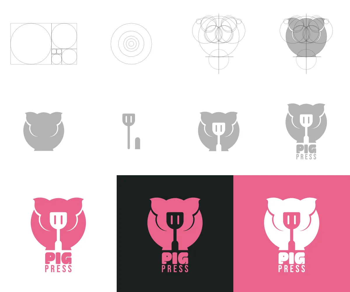
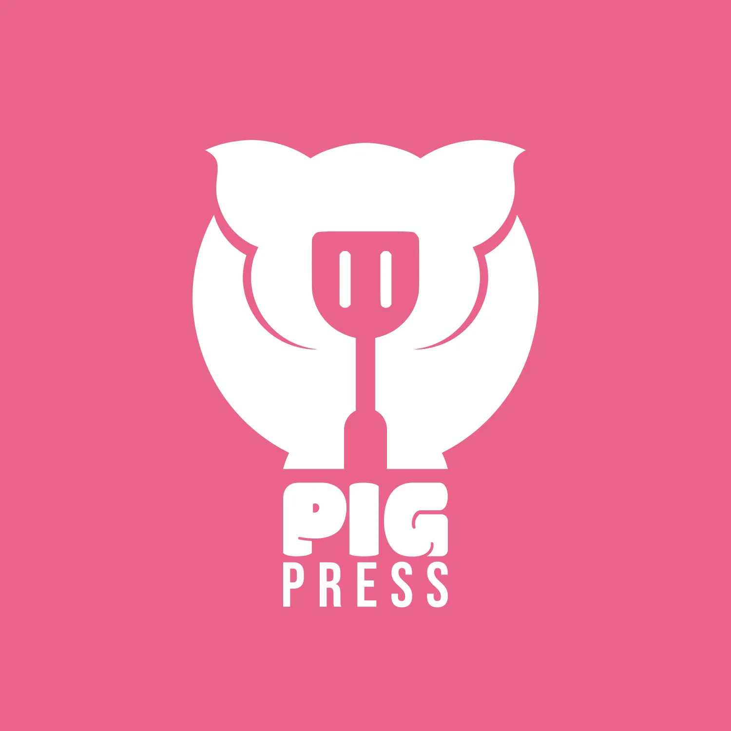
A complete logo and identity concept for Pig Press, a food-truck business specialising in pulled pork and other pork-based street food. The identity combines a simplified pig with a negative space spatula helping form the nose, creating a compact symbol that communicates the name, the menu and the character of the business at a glance.
Project details
The useful
particulars.
- Client
- Pig Press
- Role
- Brand and identity designer
- Status
- Complete
- Year
- 2025
- Place
- Crediton, Devon
- Disciplines
- Logo and symbol design · Food-truck brand identity · Geometric mark development · Print and promotional applications
The problem
The identity needed to communicate pork-based street food quickly, particularly when seen from a distance on a food truck, sign or menu. It had to feel humorous and approachable without becoming childish, while remaining bold enough to compete in a busy event or market environment.
The approach
The mark was built around two recognisable ideas: a pig and a cooking utensil. A simplified pig was constructed from rounded geometric forms, with a spatula positioned through its centre to connect the animal directly with cooking and street food. The compact wordmark and limited pink, black and white palette were then developed to remain clear across vehicle graphics, menus, packaging, clothing and small printed materials.
The result
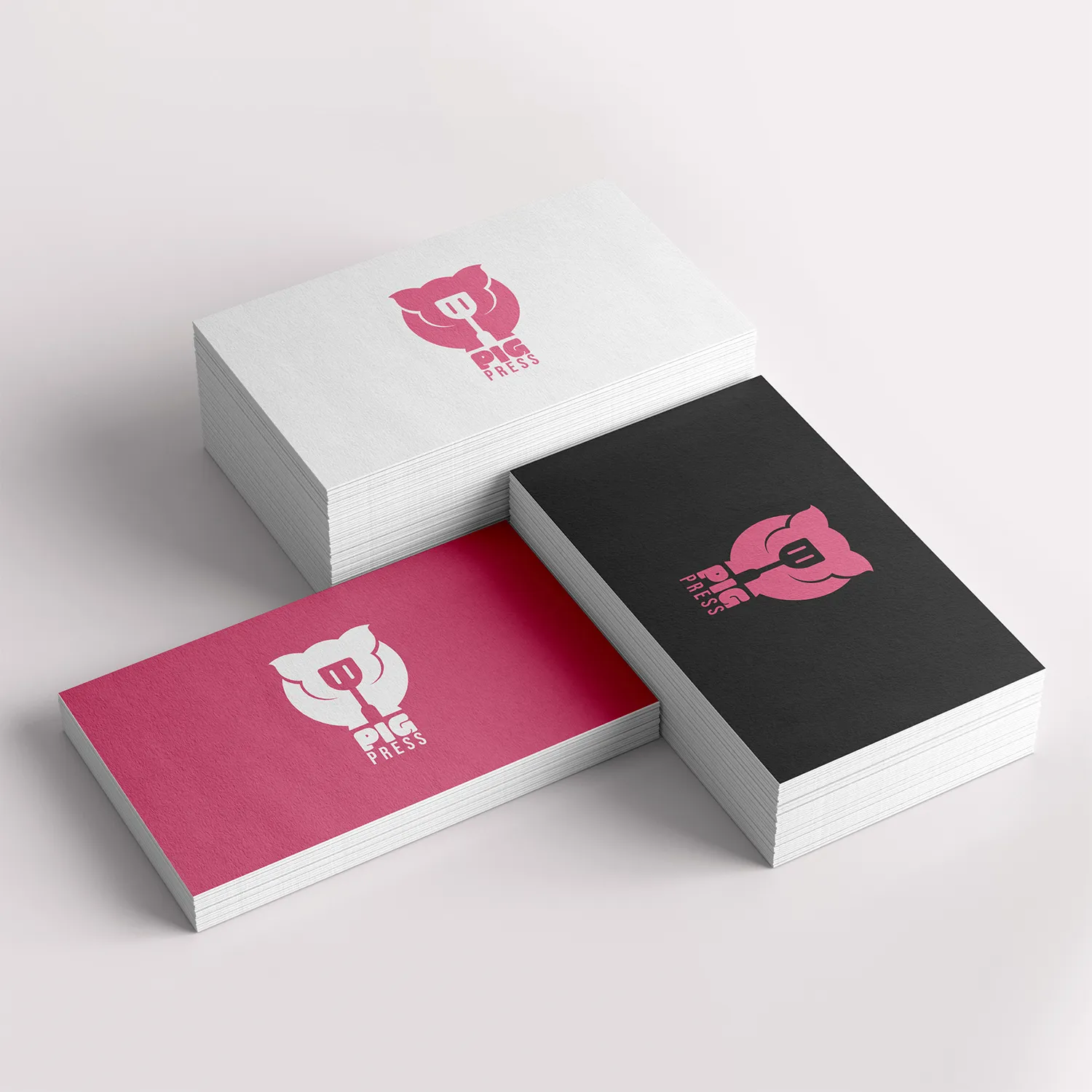
A distinctive and immediately understandable food-truck identity with a memorable silhouette and plenty of personality. The final system works as a complete logo or standalone emblem and remains recognisable across signage, packaging, menus, social media and promotional materials.