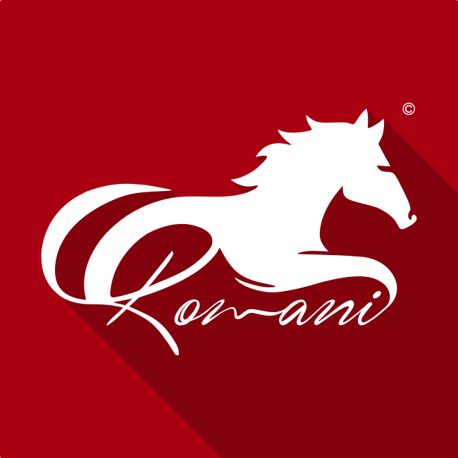
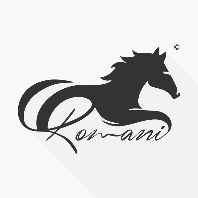
ROMANI Logo Graphic Design Project
Horses played a prominent role in the history of Romany & Travellers; They were traded, used as transportation, and utilized to pull Gypsy vardos (Caravans). They were workhorses and something proud to be owned.
I wanted to convey strength and motion in the final logo design - the horse's mane gives the impression it's moving, and the legs that blend into the typography provide the feeling of the horse mid-gallop.
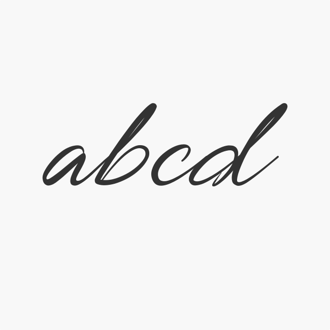
As with any logo design brief, typography plays a significant role, and in this case, I chose a script font that echoed a vintage or old "feel" to it. Rather than separating the horse and word, I wanted to merge the two into one flowing element.
I swept the horse's underside to flow with the lettering and continued the joined-up writing at the end of the word by merging the "i" into the horse's front leg. The original letter "R" in the font I selected didn't feel suitable for this design, so I created a custom letter "R" that I believe fits with the original font and resembles the horse's rear quarters and leg.
Right from the beginning of any logo design brief, I always attempt to focus on making the design work on both light & dark backgrounds. When you start introducing color into a logo, while it might look nice on a white background, setting it against a different color can make a great design appear terrible. In keeping this design monotone, changing the logo to be completely black or white (as depicted above), you can use the logo in the future under any circumstances.